


How to compare two pie charts in IELTS writing task 1. This sample answer illustrates the method of organising the report as well as useful language and sentence structures to get a band score 9.
IELTS Pie Charts
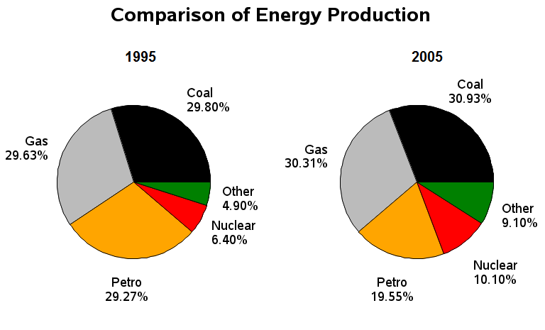
The pie charts below show the comparison of different kinds of energy production of France in two years.
Source: Above pie charts not created by IELTS Liz.
Pie Chart Sample Answer
The two pie charts illustrate the proportion of five sources of energy production (coal, gas, nuclear, petrol and other sources) in France in two years (1995 and 2005).
Overall, in both years coal and gas accounted for over half of all energy production, while the least was other energy sources. There was only a very minimal increase in production from gas and coal, whereas nuclear and other sources almost doubled. Petrol was the only energy source to decrease over the period.
Energy produced by coal comprised of 29.80% in 1995 and by 2005, it increased by about 1% to 30.9%. Likewise, the amount of energy generated by gas went up by approximately 1% from 29.63% in the first year to 30.1% by the final year. The use of nuclear power rose significantly from 6.40% in 1995 to 10.10% in 2005. Other sources of energy production accounted for 4.90% but then climbed to 9.10%.
Petrol, on the other hand, produced 29.27% of all energy in 1995 but 10 years later only 19.55% of energy came from this source.
Words = 177
IELTS Pie Chart Tips
- Introduction paragraph should introduce all aspects of the task.
- The overview must contain all key features of all pie charts. This is the most important paragraph and should not be only one sentence. You must identify the key features of both charts and present them as an overview. You are being marked on the content of this paragraph.
- Always highlight the largest and smallest proportions in the overview.
- Note whether the pie charts show change over time or comparison of categories divided by gender or in a similar way. Not all pie charts are the same. Depending on the information given, you’ll use different language and organise things differently.
- If there are two pie charts in different time periods, then you must highlight the key changes / trends.
- Use pie chart language – accounts for / comprises of / represents.
- The phrase “Units are measured in …” should be used when the units have not been stated in the previous sentence.


.png)


